

Gobik refresh your values with a new brand identity.
- The new proposal connects with the non-conformism and constant change of the brand.
- Inspired by the synergy between the starting point and the destination, the company's new symbol is born.
- "What a ride" emphasizes the experience of each departure and international growth.
With its new symbol and claimand the restyling of the name, Gobik presents a new visual identity based on these three aspects that connect with the restless character of the brand.
The path of Gobik to the present is thus gathered in a new identity that is faithful to the features that have made the brand recognized to carry the message into the immediate future and aspire to wider frontiers.

A rebranding designed to last
As Albert Medrano, head of marketing at Gobikthe work has been divided into two parts: the restyling of the word GobikThe work was divided into two parts, the restyling of the word, looking for a better readability in different formats, with a very light retouching. And then, the creation of a new symbol that allows us to communicate those same values, joining the first and last letter of the word "A" with the first and last letter of "A". Gobik”.
The new approach is faithful to the brand's roots and trajectory with the present, but at the same time offers a more contemporary vision.

The symbol emerges with "the aspiration to walk alone into the future. Initially, it may stand alone on some element, such as on a zipper pull, although in most formats it will go together with the word "future. Gobik"suggests Albert Medrano, who adds: "We are aiming high with this image, we know it, it is intrinsic to the brand and connects with the message of nonconformity in everything we do".
"We want to make the circle and the community big and that the energy that gives us the bike and that gives us this project is contagious. Our goal is to be everyone's brand." José Ramón Ortín, CEO and CoFounder Gobik.
The new logo will see the light of day in the first pre-season capsule, prior to the Cold'24, which is scheduled to start on September 8.

The experience you saw Gobik
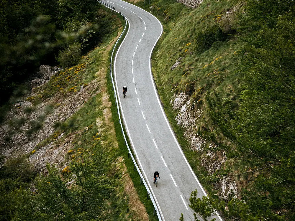
What a ride" is the new "What a ride" logo. claim new positioning that "connects with what we have been doing over the years, but at the same time revising how we presented ourselves to the world, being an expression that links us to the bicycle, but also to other aspects of life, even at the business level, to reflect how much we have grown. Gobik"continues Albert Medrano.

In this sense Alberto Garcia, CEO and CoFounder GobikAlberto García, CEO and CoFounder, specifies that "our attitude is what makes our style. Behind our design there is an attitude and an intention, also a vision about life. And we need our garments and everything we do to transmit those values and positions to the world".
"We talk about a claim round -adds Albert Medrano- that we say to ourselves every day at home, when we look at the path we have taken. In addition, it is a very recognizable message at international level, which will help us to continue growing in other countries, as we have achieved in Spain. It is reflected in the experience of each outing, of the group, of the stop along the way, we hear it in race broadcasts... it is experiential, it emphasizes the good moments on the bike and the good moments on the road, and it is a message that will help us to continue growing in other countries, as we have achieved in Spain. Gobik wants to keep dressing those moments".


