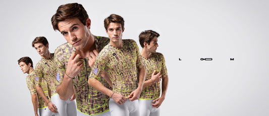


Orange becomes the new icon
The INEOS Grenadiers team, together with Gobik as their technical textile partner, proudly presents its kit for the 2026 season, marking a milestone in its visual identity. The big news comes with a brighter palette featuring a pure orange, without dark shades, a strategic move aimed at boosting the team's visibility and strengthening its recognition within the WorldTour peloton.
For the first time in the history of INEOS Grenadiers, orange becomes the central element of its visual identity. The choice is not accidental: no other WorldTour team adopts a similar aesthetic, allowing the team to stand out unmistakably. This pure tone, accompanied by a white base, brings energy and brightness without giving up the elegance and sobriety that define the team.
The design is born with a clear purpose: for INEOS Grenadiers to be instantly recognized. The exclusive use of this orange ensures a strong presence in the peloton, while the white panels on the lower part add balance and clarity, allowing the main color to stand out harmoniously. The result is a sophisticated, functional, and memorable kit.
“The INEOS Grenadiers kit for 2026 has been designed so the team stands out like never before in the peloton. Orange, an iconic color for the team, reinforces its identity within the squad and is combined with a light gray bib short, developed in close collaboration with the team management, the riders themselves, and our designers. We were looking for a color that not only offered visibility and modernity, but also made it a symbol of fashion and trend within the peloton. Everyone’s collaboration has been key to creating a kit that reflects the Ineos character; the constant drive to innovate.” explains Alberto García, CEO of Gobik
Precision, performance and identity
The design is not only aesthetic, but also functional. The new kit integrates the Reactive 2.0 (jersey) and Lancer Diamond (bib short) models, developed on Gobik’s most advanced competition collection, guaranteeing precision, performance, and comfort in every stage.
With this launch, INEOS Grenadiers reaffirms its commitment to innovation and visual identity, offering a sophisticated, functional, and memorable kit, designed so the team stands out immediately within the WorldTour peloton. Orange is the new uniqueness. Orange is the new icon.